Graphing with Climate Spirals
Finding it hard to wow crowds/classrooms with climate change data? Climate change spirals might be the spin you’re looking for. This online tool provides regular, updated versions of the climate spirals for numerous scenarios. The Kantar ‘Information is Beautiful Award’ winning project includes:
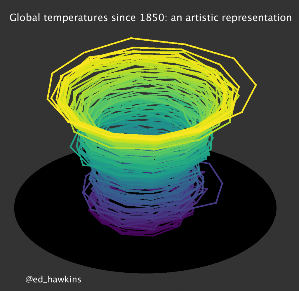
- Current version of global temperature – spiral Three-dimensions and animated
- Future projections of temperature
- Arctic sea ice volume – PIOMAS reconstruction from 1979-present, producing an inwards spiral as the volume of sea ice reduces
- Atmospheric carbon dioxide concentration – CO2 at Mauna Loa in Hawaii, showing the increase since 1958 and the small seasonal cycle
- Combined animations for temperature, CO2 and carbon budgets
Visit Climate Spirals here.